4 Things We Learned From Leading Hospitality Procurement Specialists at HD Expo
Manage FF&E specification, procurement, and product data at scale. Take on bigger projects with confidence and grow your firm with Fohlio. Automate...
Specify, procure, prototype, collaborate, and analyze at scale. Take on bigger projects with confidence and grow your firm with Fohlio. Schedule a demo or book a consultation with one of our account managers to explore these features today.
(Welcome to Part 2 of our three-part series on the psychology of great retail interior design. Today’s post focuses on retail store layouts. Sign up for blog updates to get the next installments right in your inbox!)
Good retail store layouts are those that improve on two things: revenue and customer experience. Too often, retailers forget about the latter component in pursuit of the former.
This is a big mistake, as research has shown that whoever delivers the better experience typically reaps the higher revenues. In the current era of the “experience economy,” it becomes even more relevant: Your store may be selling physical objects, but your customers’ experience is an intangible but crucial prerequisite of the sale.
Another reason experience is important: Remember that retail store interior design is meant to influence customers’ behavior. By carefully considering the design and spatial arrangements of the store, you can drive more sales.
When putting together the floor plan for your space, there are a few factors to consider:
This is the visual component of your space, and involves the use of floor plans and strategic space management. Besides making your retail store pleasing to the eye and supporting brand identity, you can also use this to tell your story.
Read: FF&E Specification in Excel is Killing Design Firms — Even the Big Ones
This is a pattern in which a customer navigates a store and interacts with merchandise. Tracking and observation techniques have shown that people who enter a store generally follow a set pattern. For example, 90% of North American customers will turn immediately to the right. Most shoppers, especially women, will avoid spaces that will likely result in bumping bottoms with other shoppers.
Before customers ever set foot in (or even see) your store, they’re already unconsciously forming opinions based on the location that they’re in. Besides dictating rent, location also sets expectations for your store. If you’re a high-end retailer of homewares, for example, you wouldn’t want to be located in a run-down neighborhood.
Read: State of Commercial Real Estate (Threats and Opportunities)
Many retailers — especially smaller ones — have taken to disregarding window displays altogether. Don’t make this mistake. According to Linda Cahan, a retail visual design expert, “Each window should tell a story.” Just as the eyes are the windows to a person’s soul, so store windows offer glimpses of the treasures within.
Again, consider your market. If you’re a high-end retail store, you’ll want to remember that space conveys luxury. Think of jewelers: Only a few items at a time are displayed in windows, sending the message that each piece is special.

If you’re a bargain store like TJ Maxx, a bit of clutter will actually work in your favor. Merchandise heaped together reinforces the idea that customers are getting a great deal.
Retail Store Layouts and Their Effects on Customer Behaviors
As we mentioned above, there are behavioral patterns that stay consistent among the majority of shoppers. Here’s how you should take advantage of these tendencies through your store’s floor plan.
This is a popular name for the first 10-15 feet of space within a store, depending on its overall size. In this area, customers are transitioning from the outside world and into the one you’re creating for them. Two tips: Make a good impression, and don’t try to sell.
While your customer is getting their bearings, it’s your chance to introduce your brand. At this point, customers are making assessments as to how high- or low-end your products are likely to be and what your story is.
Because their brains are busy with transitioning, they’re “more likely to miss any product, signage, or carts” that are placed in this area, says product designer Humayun Khan. Therefore, hold off on the important merchandise you really want them to see, and instead focus on that initial experience.
Read: How to Take Your Firm to The Next Level With a Digital Materials Library: 9 Ways
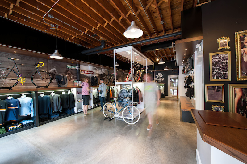
Most North American shoppers will immediately make a right turn upon entering the store — likely because we drive on the right side of the road and have a tendency to turn right.
By now, they’re ready to look at your merchandise in detail. That means this area should contain your “power wall”: a display area which should make the biggest impact on your customers.
Unless you’re a big box store that benefits from customers coming in, purchasing, and then quickly leaving again, it’s best to lead them on a guided tour. This way, you can have greater control over their experience, and thus better chances at influencing their purchasing decisions.
A small store works best with a loop layout (more details on this below) because there’s a clear path for customers to go.
Read more: Putting the Fast in Fashion: How Zara Drastically Reduced Lead Times
Yep, it’s a real thing, coined by consumer behavior expert Paco Underhill. The term refers to a typical customer reaction from when their backside is brushed, or has a good chance of being brushed. Most shoppers, especially women, will avoid aisles when this is the case, even if they’re very interested in the products that are on display.
Strange though it may seem, this problem has a very simple solution: Just make sure there’s adequate space for people to move in without bumping against each other.
Learn more: How to Curate Materials and Standardize Workflows
A fundamental principle in the layout of Japanese gardens is the creation of small discoveries. The same experience is very effective in retail store interior design: Use curves and angles, lead the eye down the path with promises of more treasures (you can use a different texture and color on the floor or wall for this), and then create a separate “mini experience” at the end.
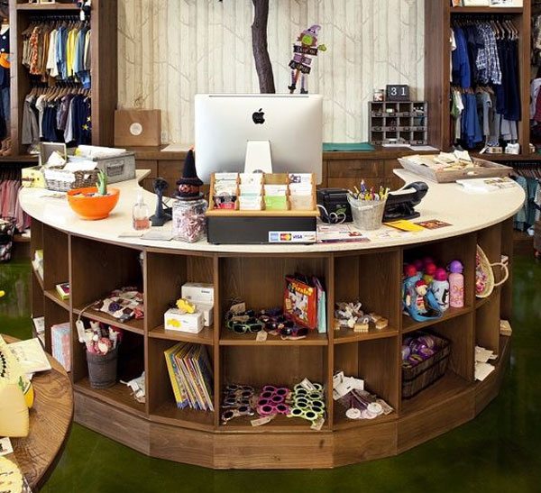
Just because customers have reached the “end” of their shopping experience (i.e. the cash register) doesn’t mean their shopping has to stop. Display low-cost merchandise on or near the registers: It encourages customers to add an item or two on top of their purchase.
There are a few types of retail store layouts that almost everyone uses. Each is typically suited to a particular type of store as they produce different kinds of behavior.
This floor plan is pretty straightforward: It utilizes repetitive patterns through the use of parallel shelves. This layout works best in groceries, big box stores, drugstore, and convenience stores — basically, stores that sell different categories of shelf-stocked goods like canned food, hardware, toys, homewares, or books.
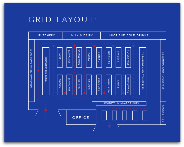
The main advantage of grid retail store layouts is that they are economical: They maximize every inch of floor space, including corners. They’re also easy for store owners to categorize.
Straight floor plans are also a cinch for customers to navigate and help save time. It’s easy to skip to the sections they need to visit, grab what they need, and leave.
However, it is exactly this grab-and-go attitude that will hurt other types of retail stores: They don’t exactly invite leisurely browsing.
Read: 8 Elements of an Indispensable Digital Material Library
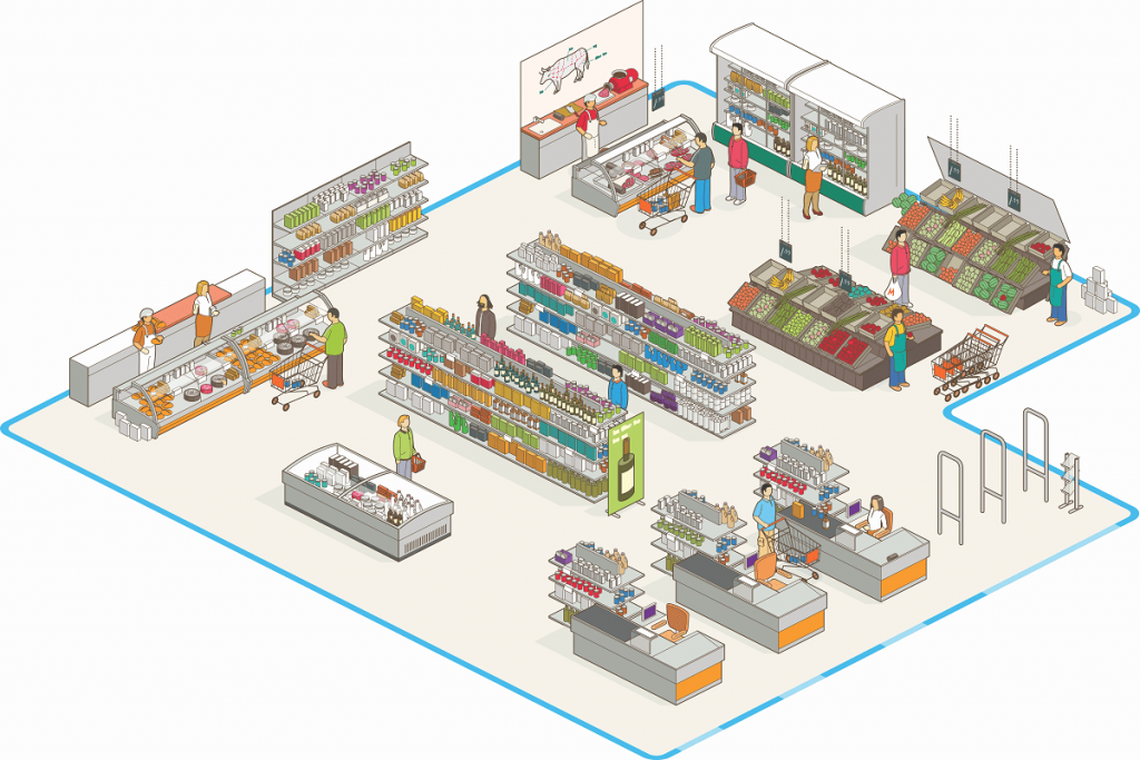
This layout is composed of a roughly square box with an island in the middle. It can be used in a small space, or in a big box store that will benefit from zoning (thus creating several areas with loop layouts).
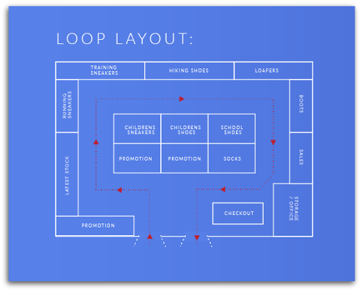
Contrary to its name, a “racetrack” retail store layout is actually the better choice for a more relaxed shopping experience. The loop is a simple but guided experience: Customers have a logical path to follow, and this clear sense of where to go next lends itself to a great storytelling opportunity.
The tendency to turn right and then follow a path means your biggest, most eye-catching display will work well on the wall immediately to the right of the entrance. The cash register should then be positioned to the immediate left of the entrance — in other words, the logical “end of the path.”

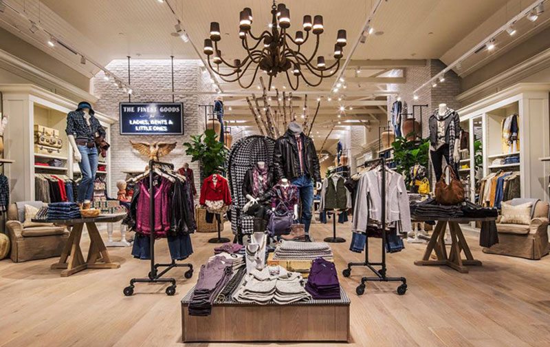
The free-flow is a favorite with upscale retailers. This floor plan is open, with lots of opportunities for creativity, switching things up, and creating special focus zones.
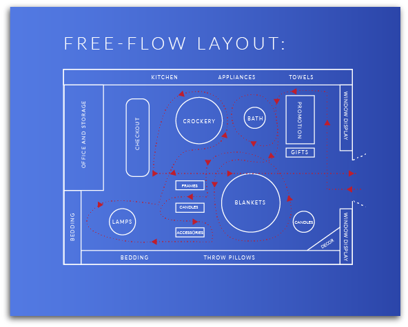
With this floor plan, there are open sight lines throughout the store. This means a power wall can be made visible from any angle. It also means you can create mini experiences in different zones.
Since there are no definite traffic flows, this layout works best for a store that has a smaller inventory and necessitates slower browsing.
Of all the floor plans, this is the one that is most highly controlled. A great example is IKEA.
According to Alan Penn of the UCL Bartlett School of Architecture, despite stores being of enormous size, the customer flow was “extremely uniform and efficient.”
“If you shop in IKEA, all you do is follow people around the store,” Penn said. “You very seldom find people going the other direction.”
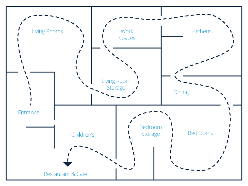
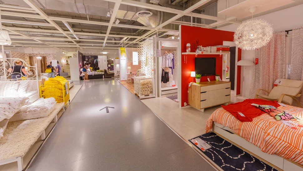
Penn had other observations, as well: IKEA is pretty “disorienting and yet there is only one route to follow.” Most of your time is spent in showrooms where you can’t purchase much. It essentially overwhelmed customers and removed their autonomy — so by the time they get to the marketplace where they can buy merchandise, they “feel licensed to impulse purchase.”
Specify, procure, prototype, collaborate, and analyze at scale. Take on bigger projects with confidence and grow your firm with Fohlio. Schedule a demo or book a consultation with one of our account managers to explore these features today.
Watch out for the next installment of this series!
Sources/further reading:
Fit Small Business
The Balance Small Business
Business Insider
Shopify
VDTA
Entrepreneur
QuickBooks
Subastral
Cahan and Co.
DotActiv
Learn how to:
Manage FF&E specification, procurement, and product data at scale. Take on bigger projects with confidence and grow your firm with Fohlio. Automate...
Manage FF&E specification, procurement, and product data at scale. Take on bigger projects with confidence and grow your firm with Fohlio. Schedule a...
Manage FF&E specification, procurement, and product data at scale. Take on bigger projects with confidence and grow your firm with Fohlio. Schedule a...