<img height="1" width="1" src="https://www.facebook.com/tr?id=420397589986244&amp;ev=PageView &amp;noscript=1">

New: Pick Suppliers Faster + More Visual Cues

featured-image

We’ve rolled out two major improvements to help you:

  • Keep your workspace more visually organized.
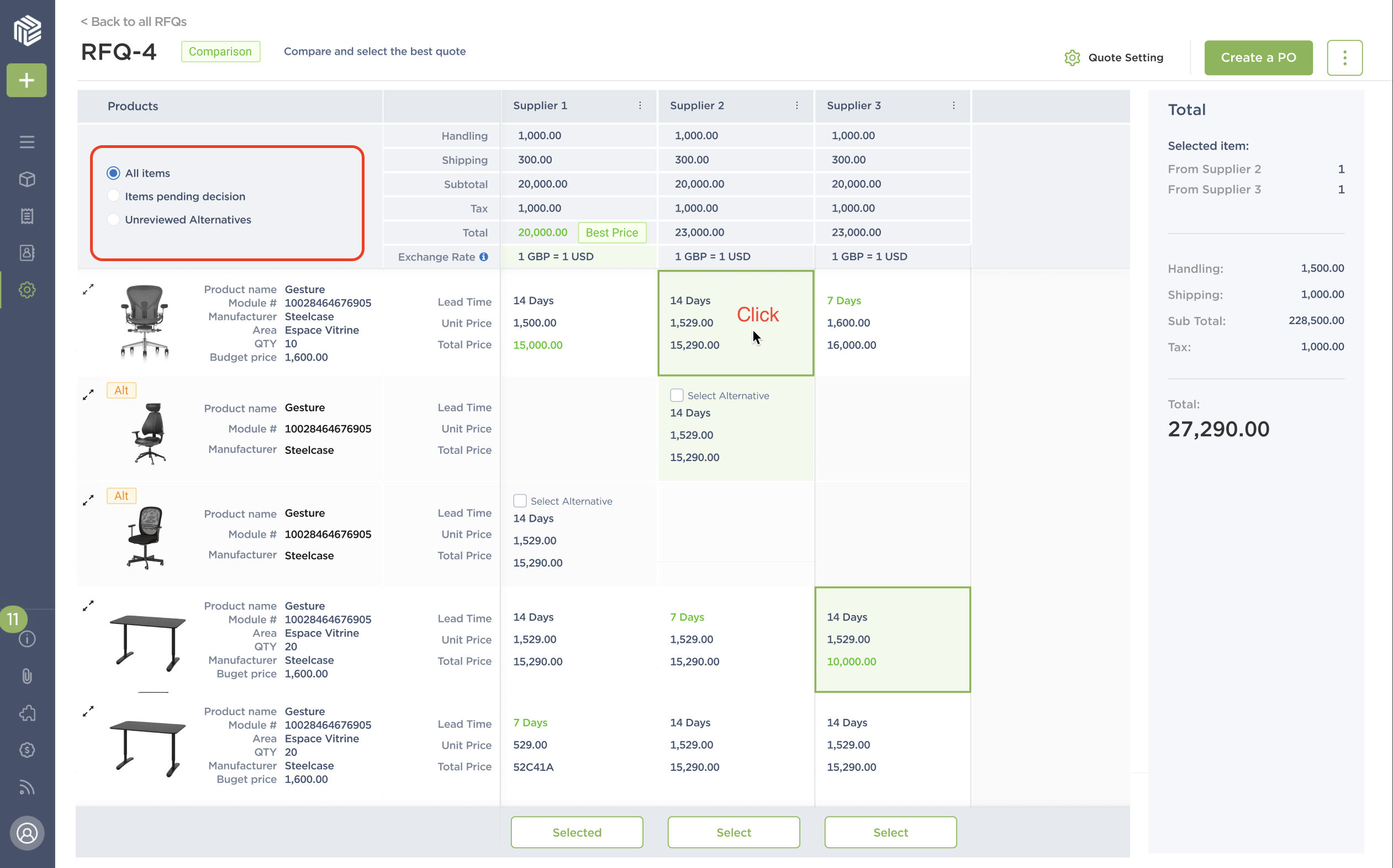
  • Select multiple suppliers straight from the comparison table.

1 - Icons to ID Your Columns

You’ll notice tiny icons to the left of your column names.

Green means it’s Fohlio-created (came with your account by default) and gray means it was created by your team.

There are three shapes: A cube means it’s a library column, a calculator means it’s for cost analysis, and a receipt means it’s for procurement.

2 - Hide Your Columns

Having all the data at your fingertips is great – but you don’t want to see all of them, all at once, all the time.

Solution: Just hide them!

Now it's easier to focus on the task at hand!

3 - Mix and Match Suppliers in One Place

You can now assign any supplier to any item in the RFQ comparison table. The best price and lead time are highlighted to help you decide faster.

4 - Highlight Items That Need Action

Forgot to make selections? That’s all in the past! One click will show what you need to do to wrap your RFQ in a neat little bow.

This release also includes bug fixes and performance improvements to enhance overall stability and functionality.

And finally, we're working on a feature that will allow you to compare quotes in different currencies – keep an eye out!

Happy Creating!

- Shawn Chen

Expore Fohlio

Learn how to:

  • Save days of work with faster specification
  • Create firm-wide design standards
  • Automate and centralize procurement
  • Keep your whole team on the same Page
  • Manage product data
  • Track budget against cost in real time.
  • Prepare for asset valuation
Know more

Published May 23, 2023