Manage FF&E specification, procurement, and product data at scale. Fohlio helps you take on bigger projects with confidence and grow your firm. Sign up to explore these features today.
We’ve long associated healthcare with the color white: It’s clean and sterile. Doctors wear it. So do nurses.
But as healthcare design becomes more sophisticated (ie patient-centered and supportive of wellness), there’s been a growing realization of how important it is to fine-tune color palettes.
Learn more: How to Elevate Patient Care Design Standards
Besides the psychological impact on a patient (and the speed and likelihood of their recovery), colors are also utilized as a communication tool and signaling system among healthcare staff.

The Cultural Meanings of Colors in a Healthcare Setting
Let’s take a look at the first assertion we’ve made, which is that white is associated with cleanliness and health. This may be almost universally true in the West — and therefore appropriate for a setting that promotes wellness — but that’s not the case everywhere.
Learn more: How to Curate Materials and Standardize Workflows
In China, for example, white symbolizes death and mourning — not the concepts you would want to invoke where the sick are convalescing.
If we look to older references like Greek and Roman mythology and the Old Testament, the meaning of colors are derived from nature. Yellow was associated with warmth and fertility because of the sun, green symbolized youth, newness, and hope because of spring, and red represented power because it was the color of blood.
Colors also carry psycho-biological signals: Black could mean mold, decay, and excreta. “Red is associated with blood, mother and child ties, war and hunting. And white color is linked with semen, mother’s milk, and reproduction.”
Psychological Impacts in the Healthcare Environment
There are a few widely held theories on colors’ specific impacts on patients. Again, however, it’s important to note that differences in culture could alter these effects.
Red is believed to be energizing and encourage alertness: It’s recommended for patients with dementia, who need the brain stimulus. It’s also great for memory care services in senior homes.
On the other hand, red is not recommended for patients who need a lot of rest and sleep, as it can cause anxiety and over-stimulation.
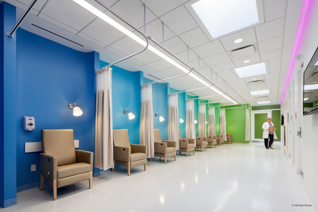
Blue, green, and purple, especially in cool muted hues, can be very calming. They’re great for hospital rooms, wards, waiting areas, and wellness centers like spas.
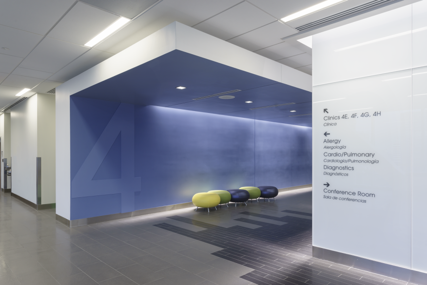
Perhaps more important, however, is creating balance and contrast with different colors and saturations. For example, a room that’s predominantly “cool” needs to be balanced with “warm” but neutral elements like wood.
Retirement facilities can’t be predominantly bright red, although lots of warm, highly saturated hues against dark and/or neutral backgrounds can give them a bright, homey atmosphere.
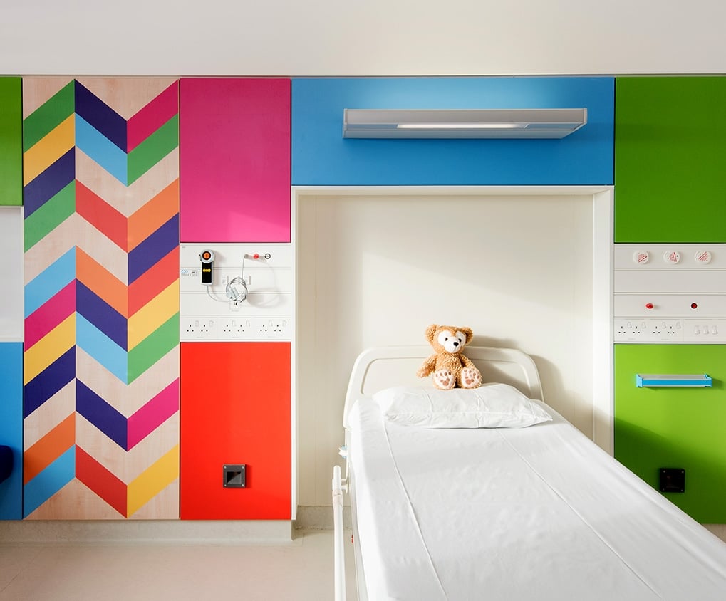
In children’s hospitals, or even in hospitals that have areas where kids can be active and creative, contrasting colors can provide that stimulation, or at least a signal that being energetic is encourage in this area.
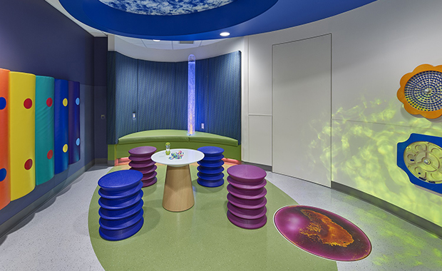
A clever use of color is to keep most of a patient’s room cool or neutral and then use something bold behind the patient’s bed. “If someone is coming to visit, they’ll walk in the room and have the sense of something a little more colorful instead of neutral color walls. There will be some sense of color in there, but it’s not something the patient would be staring at all day,” says Jackie Jordan, director of color marketing for Sherwin-Williams.
Colors as a Signage System in Hospitals
Color is also a way for hospital staff members to communicate. The International Organization for Standardization (ISO), the Occupational Safety and Health Act (OSHA), and the American National Standards Institute (ANSI) have established guidelines for markers in hospitals.
Red is a signal for danger and an indication to stop. It’s also used to mark protection equipment and apparatus (like fire exits, fire extinguishers, stop buttons, and electrical switches).
Green, on the other hand, indicates safety and the location of first aid equipment like a dispensary, stretchers, and safety deluge showers.
Dangerous parts of machinery or electrical equipment that can cut, crush, or injure are marked orange (exposed pulleys, gears, rollers, power jaws, and more).
Caution and hazards that involve tripping, falling, stumbling, getting caught in between (like construction equipment, handrails, and guardrails), and the like use yellow.

Purple on yellow signify radiation hazards like radioactive materials, and containers, burial grounds, and storage areas for radioactive materials.
Black, white, and combinations of black and white are used to direct traffic and for housekeeping (indicating dead ends in aisles, locations and widths of aisles and hallways, etc).
Fohlio allows you to manage your entire team and all your workflows in one place. With Fohlio, you can specify, procure, manage spec sheets, and more on one platform: Collaborations are easy and workflows are much more efficient than ever before! Get your free demo today — so you can design and build more profitable projects.
Featured image: Sheffield Children’s Hospital
Sources:
The Art and Science of Healthcare Design
Healing Hues: Choosing Paint Colors for Healthcare
Psychology of colors in healthcare spaces
Color in Healthcare Environments
The Best Healthcare Design of 2016
Expore Fohlio
Learn how to:
- Save days of work with faster specification
- Create firm-wide design standards
- Automate and centralize procurement
- Keep your whole team on the same Page
- Manage product data
- Track budget against cost in real time.
- Prepare for asset valuation
Published Mar 31, 2020

